Armilla
Go where the water flows.
01 · Kontext
Ein Typografie-Workshop in Kooperation mit Professor:innen der Maryland Institute College of Art (MICA).
02 · Konzept
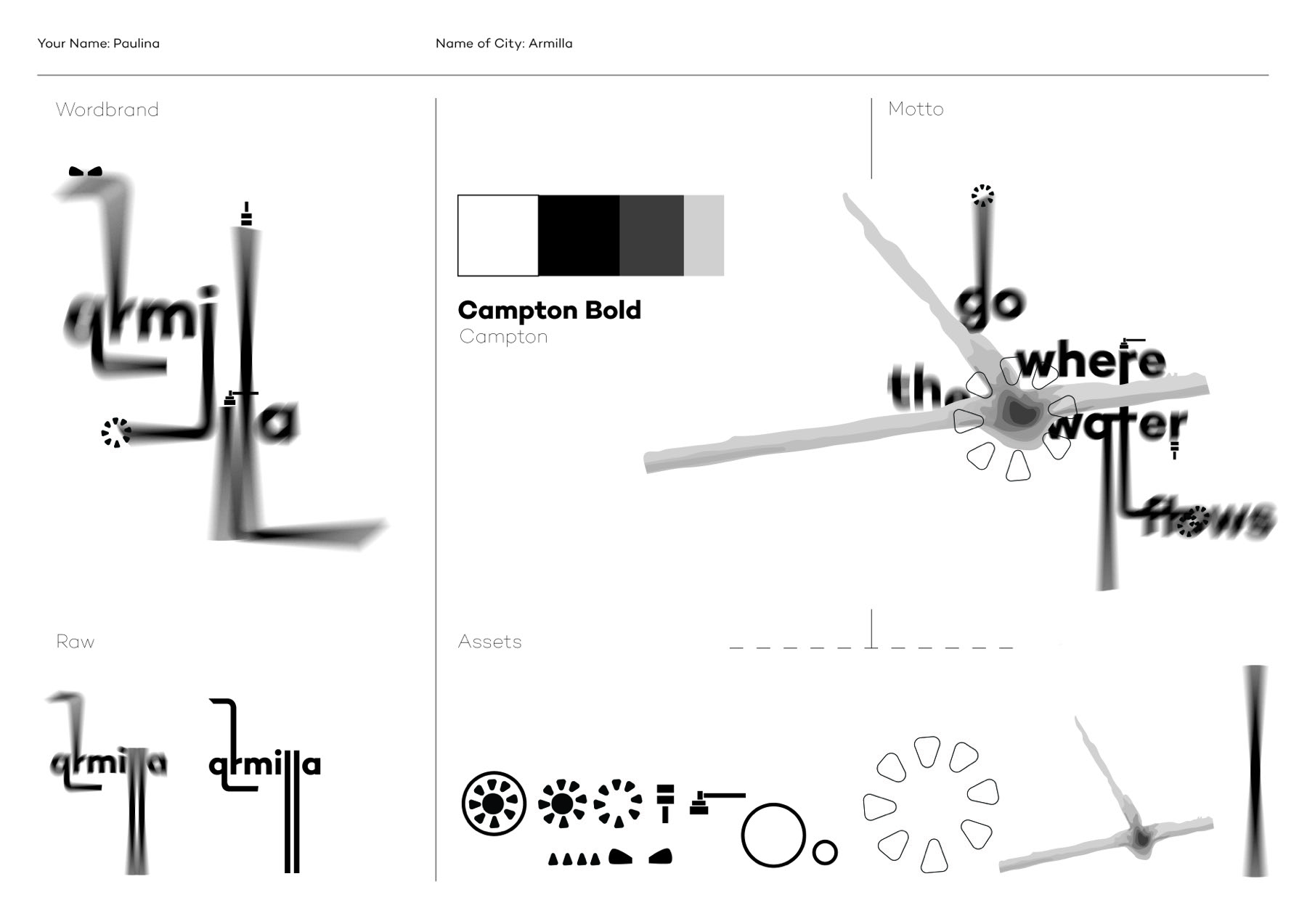
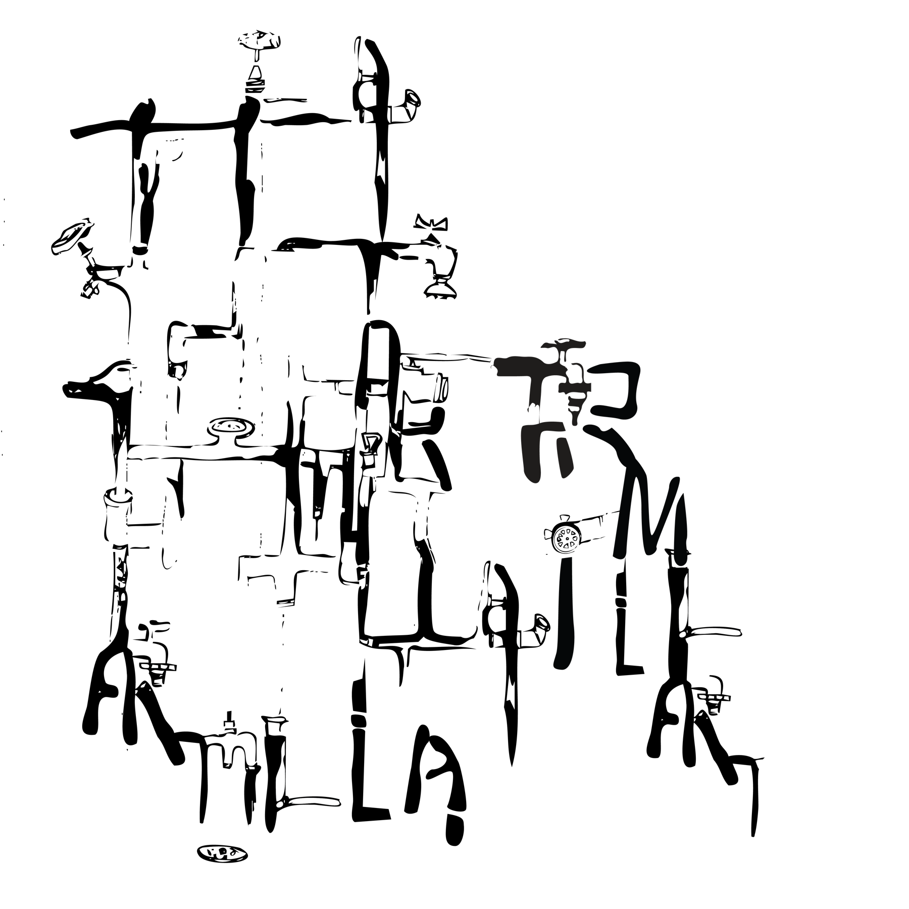
Eine visuelle Identität und ein Poster für eine fiktive Stadt, „die große Entkalkung", rein typografisch erzählt. Ausgangspunkt ist kein fertiges Bild, sondern ein Tool Kit: Wordbrand, Rohmaterial, Assets, Farb- und Schriftsystem (Campton Bold). Das Poster ist die Übersetzung dieses Kits in eine finale Form.
03 · Prozess
Ausgangspunkt ist kein fertiges Bild, sondern ein Tool Kit: Wordbrand (die Rohform „armilla" verzerrt und verflüssigt), ein Farb- und Schriftsystem (Campton Bold) und ein Satz an Assets: Icons, Symbole, Formen. Das Motto „go where the water flows" liefert den gedanklichen Kern für die Stadt.
04 · Ergebnis
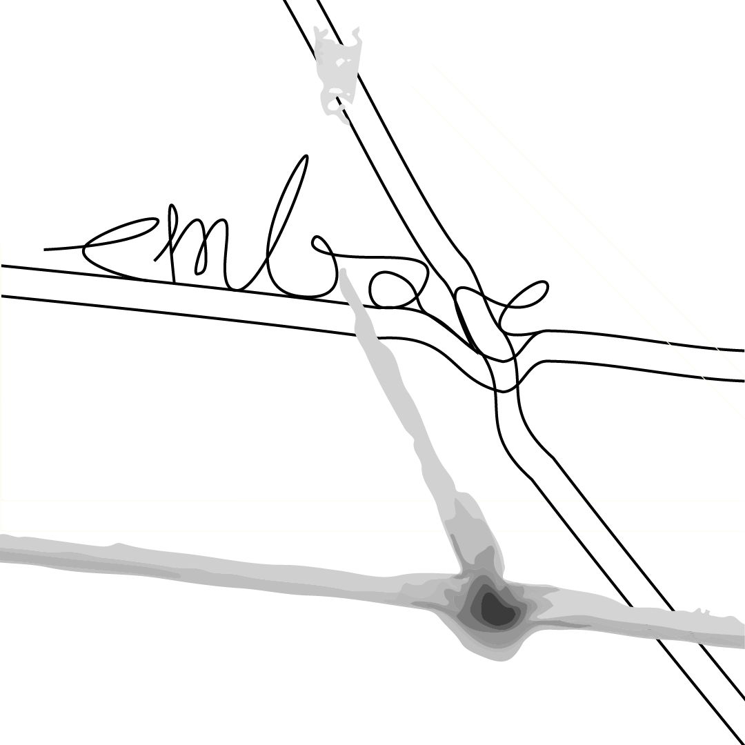
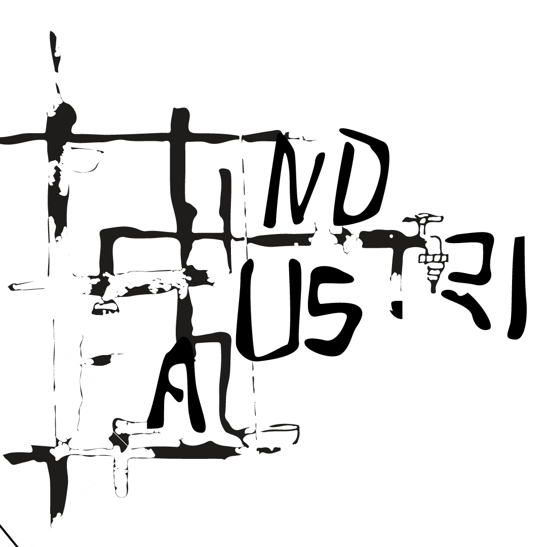
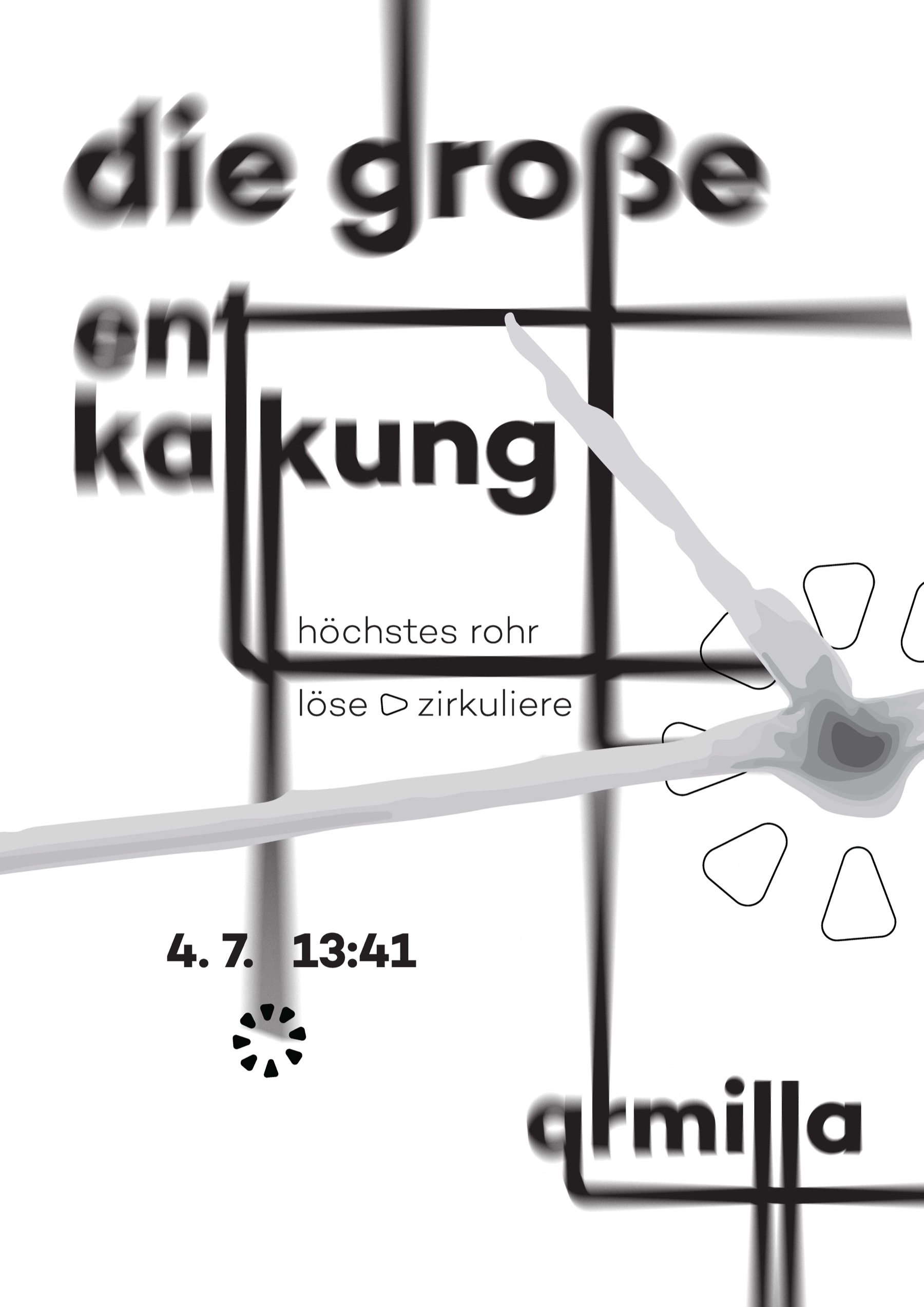
Aus dem Tool Kit übersetzt: das finale Poster „die große Entkalkung", Wordbrand, Motto und Assets verdichtet zu einer typografischen Rauminstallation.
Brücke: Armilla trägt denselben Gedanken wie Abstractinator: Design als Werkzeug statt Einzelartefakt. Beide Arbeiten gehören inhaltlich zusammen.